An addendum to Phillips answer.
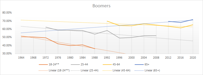
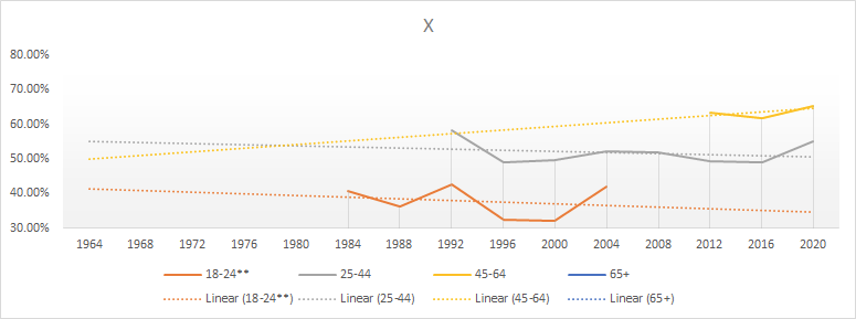
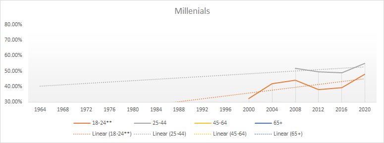
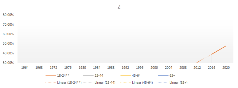
The graph is better if you show where people exist.
This isn't accounting for general trends like others mentioned, but looking at compositions, we can see a consistent gain in groups/trends where Mills and Z were active, vs a general drop in groups where Boomers and X are plentiful
Source for generation age definitions
Source for data, same as Phillip


