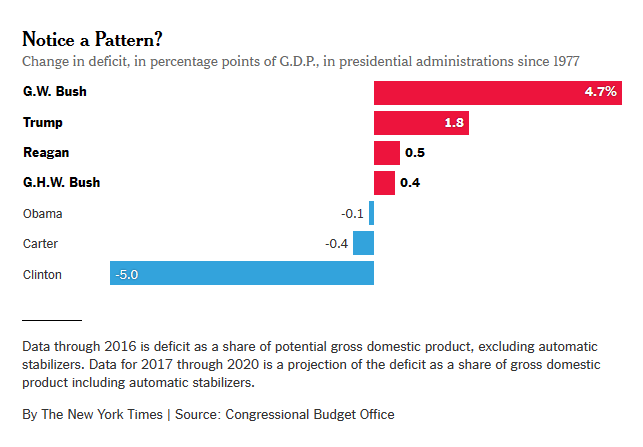
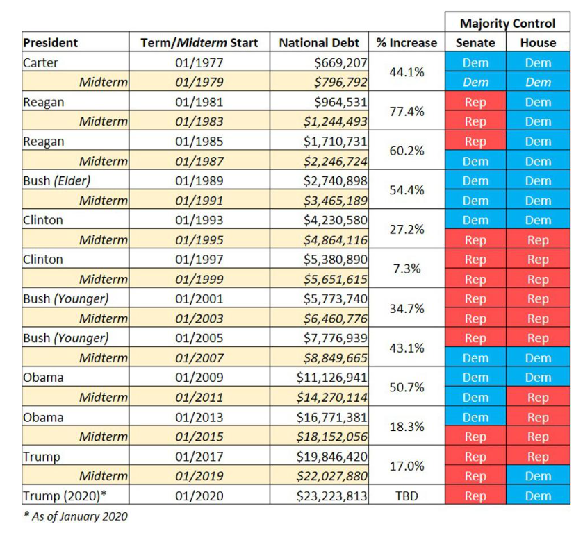
This seems to indicate that the first source is wrong, because the US federal deficit went in only one direction (up) under all three presidents that allegedly decreased the deficit.
Well, the correct way to [somewhat] relate the 2nd table to the first graph is to see that the debt went up less during (e.g.) Clinton's presidency than the rest you've mentioned. There's the confounding issue that the graph has full terms combined but the table is split by term. (Furthermore, as Ben pointed out as I was writing this, the first graph is also relative to the GDP, while the 2nd one isn't.) Still, you can see that 7% in Clinton's 2nd term is the lowest debt increase in that table, and that is compatible with the largest deficit reduction claimed in the 1st graph.
Comparison between those two metrics aside, whoever was president is clearly only part of the story in the 2nd table as e.g. "cohabitations" of a Republican congress and a Democratic president (both during Obama and Clinton) resulted in less debt increase than when either had a Democratic Congress. I suspect that if you had a bar graph for deficit changes split by term, you'd see that there as well.
There's one more thing to note, namely that the 1st graph is not (sorted) in historical order. As you can see from the table, "who came before" matters in terms of how big of bar you get, e.g. Clinton came after Bush the elder who saw large debt increases, so Clinton's deficit reduction (relative to Bush the elder) is also large (and negative) because of that. But G.W.Bush gets the largest increase in the graph because he came after Clinton, even if debt increase during his time doesn't look all that different from Bush the elder in % terms from the 2nd table (at least per term). And Obama gets an "about par" graph bar because he came after G.W.Bush, which is a non-obvious reason for the bar differences between the two of them in the 1st graph, at first glance. Essentially what I mean by this last para:

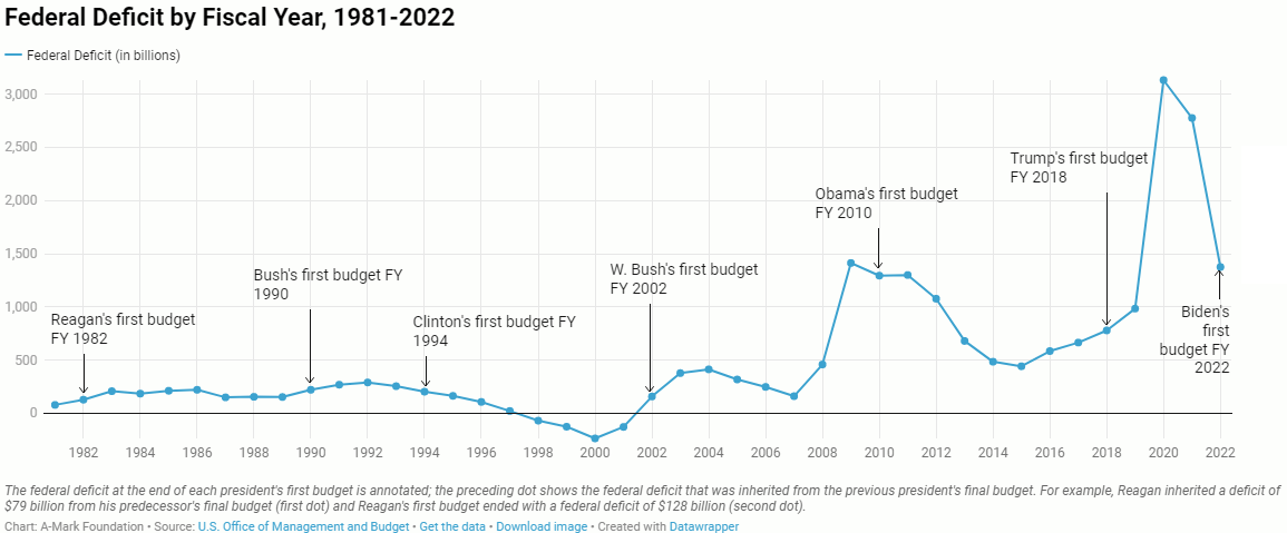
And if you're willing to forgo GDP relativization, but want to see the deficit (as opposed to the debt) evolving, something like this is probably more useful

(They also have [very large] table that also has a column ['chart' 3.D] with that relative to GDP, but no graph, and I'm feeling too lazy to make one myself.)
By the way, the NYT (1st graph) numbers were only projecting for Trump's term in 2017, so don't have Covid effects actually included.
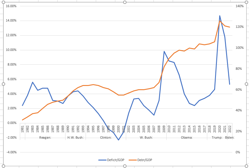
Actually, here's the /GDP version of that with debt done the same (from their data). HTH
