On 14th of May, millions of Turkish voters went to the polls to cast their votes in the parliamentary elections. Recently, the official results were published in the website of the Supreme Election Council.
As a data science enthusiast, I decided to download the results and play with them. There is a 2012 paper that suggested to plot the histogram of voter turnout against the votes that the winning party got for each ballot. Namely, for each ballot, we compute the voter turnout, obtained by
and we consider what ratio of voters voted for the winning party
The paper suggests that the histogram should look 'unimodal'. Unimodal means that there is a single mode of the data, that is, there is a single voting behaviour around which all ballots are concentrated, within a certain margin of error. As an example, we might see that most of the ballots have similar turnouts, say %90 and similar percentages for the winning party, say, %40. Otherwise, the authors argue, the results can be considered anomalous (possibly due to fraud, or some other explanations).
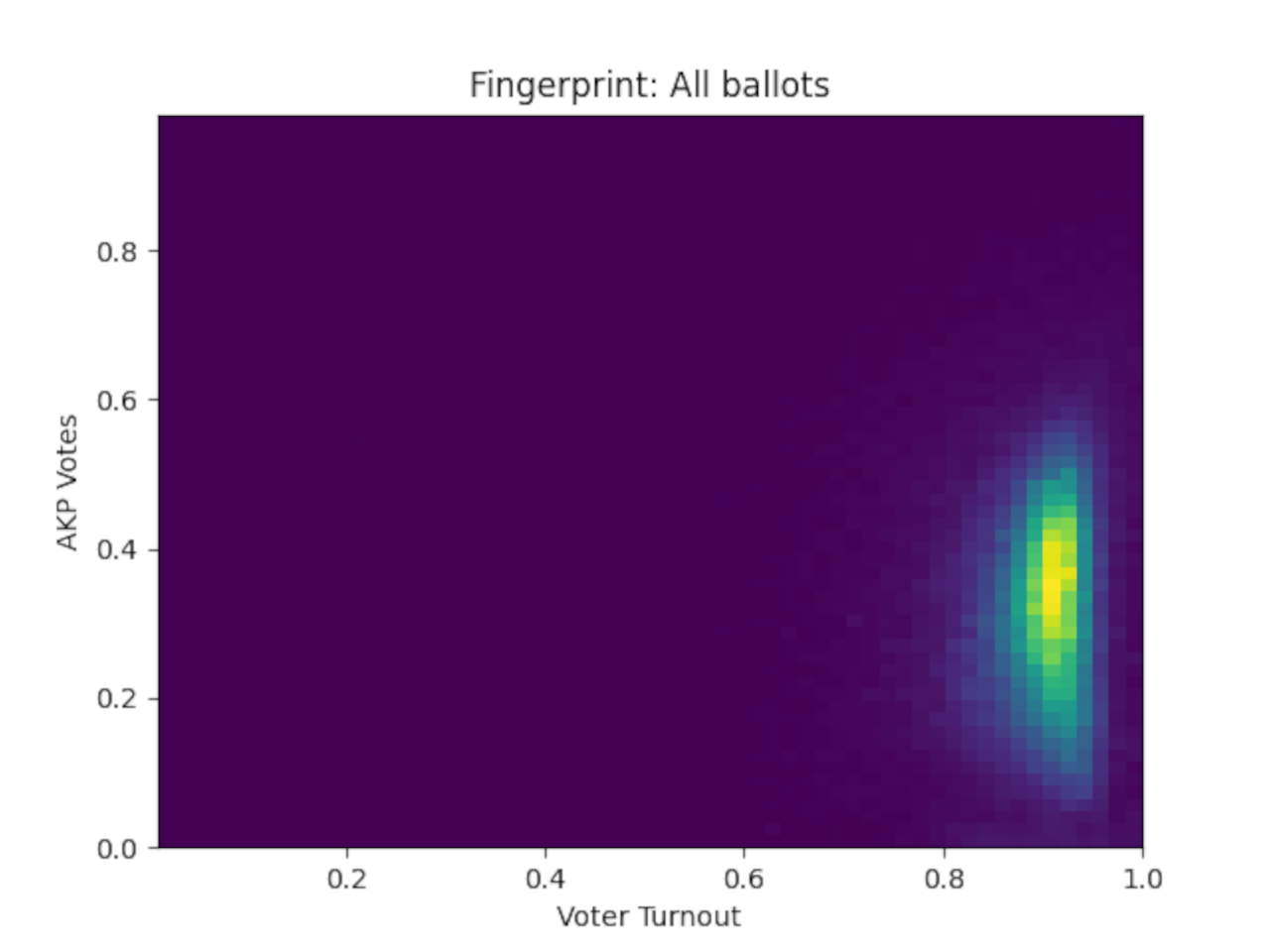
The following is the fingerprint (the term used in the aforementioned paper) of the whole election. Each ballot contains a number of votes between 10 and 400. The x-axis is the turnout, the y-axis is the votes for the winning party (namely, AKP). The colors reflect the number of ballots with the same xy-coordinates. Dark colors mean that there is a small number of ballots in that box and the light colors mean there is a big number of ballots in the box.
As you can see from the plot, the voter turnout is concentrated around %90 because that is where most of the light colors are. AKP got approximately %35 of the votes and the plot is slightly smeared, between %10 and %50.
This plot certainly looks unimodal, since all light colors are close to each other and connected.
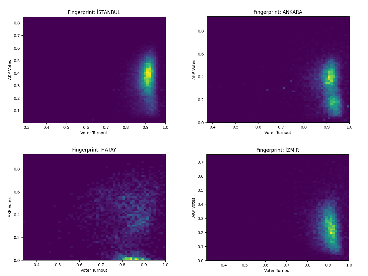
Then I considered the fingerprints of the election results of 4 cities, the 3 cities with highest population, Istanbul, Ankara and Izmir and the city that was recently affected by a major earthquake, Hatay. Namely, for each city, we only consider the ballots in that city and we plot the voter turnout and the votes for the winning party, just like we did for the whole election.
One can see that Istanbul and Izmir have unimodal plots, indeed Istanbul looks almost the same as the fingerprint of the whole election. Izmir looks also similar the the first fingerprint, however it is translated down, the ballots are concentrated around %20 for AKP.
On the other hand, Ankara and Hatay look different: their fingerprints are bimodal, i.e., have two modes. Ballots in Ankara are concentrated around two percentages, %20 for AKP and %40 for AKP. Hatay's fingerprint is also bimodal, there is concentration around <%10 for AKP and >%40 for AKP.
This is what I want to understand.
What are the possible explanations for the election fingerprint of Ankara and Hatay to look bimodal whereas Istanbul and Izmir don't?
Disclaimer: Some commentators suggested that the question might lead some people to jump to controversial conclusions. I don't think the data above suggests fraud in Turkish elections. There is a myriad of possible explanations for the fingerprints above and these reasons are what I am looking for.


