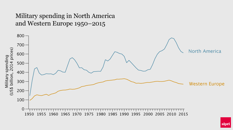
I found a (North America proxy) graph of US military spending in absolute real terms (i.e. adjusted for inflation).
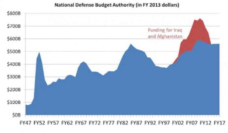
As you can see, in absolute terms, even adjusting for inflation, the US has spent more in the 2nd Gulf War aftermath than during the Cold War.
Similar (WaPo) graph isolating some (recent) war budgets (but not older ones like Vietnam etc.):
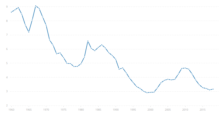
But this (neither of these) graphs accounts for the growth in GDP. So, is there a graph of US military spending as percentage of GDP (and does it look substantially different than the above)?
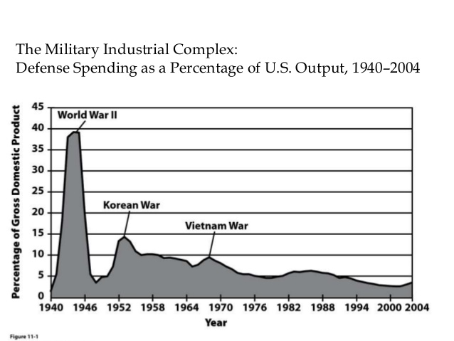
N.B. I found one (relative to GDP) that stops in 2004, so not really helpful for a comparison after that, i.e. the post Gulf War II peak is not visible in this one...


