62

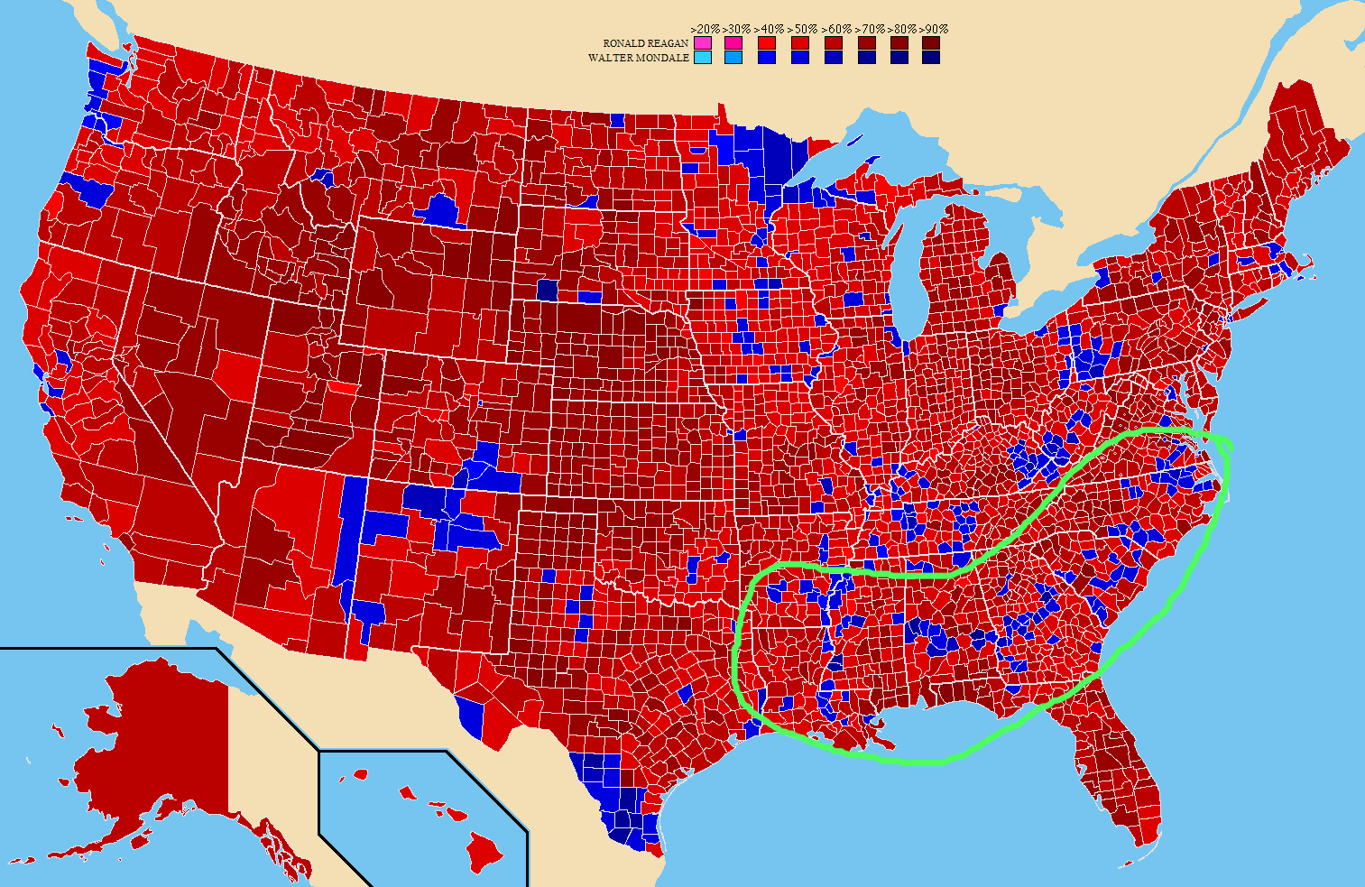
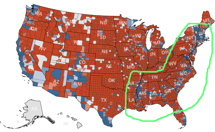
Here is a preliminary image from The Guardian showing the individual counties during the 2016 election in the United States:

Party vote by county

There appears to be a line of counties in blue, curving from Maine in the north-east to Mississippi in the south. Those counties would have voted for the Democratic party, but they are massively surrounded by Republican counties. Is there something in common between them?

11
  • 11
    I think that band follows Interstate-20, which has some significant population centers on and around it.
    – Jimmy M.
    Commented Nov 9, 2016 at 6:04
  • 1
    @JimmyM. Map of I-20. It's somewhat close in the southern part, but it stops in South Carolina, less than half the curve.
    – isanae
    Commented Nov 9, 2016 at 6:08
  • 3
    I have the impression that much of trump support has come from rural areas, as this would be less densely populated, this sounds along the right lines to me. Commented Nov 9, 2016 at 7:30
  • 7
    In general, blue spots are where lots of people live. Red is where fewer people live.
    – user1530
    Commented Nov 9, 2016 at 19:26
  • 12
    Wow. The answer by @isanae below ("A combination of the Black Belt and Northeastern region") is incredibly detailed and well sourced. That is the kind of Answer that we look for in Stack Exchange.
    – O.M.Y.
    Commented Nov 9, 2016 at 21:49

11 Answers 11

46

A combination of the Black Belt and Northeastern region

What first appeared to be a long unbroken line of counties from north to south actually seems to be made of two major parts.
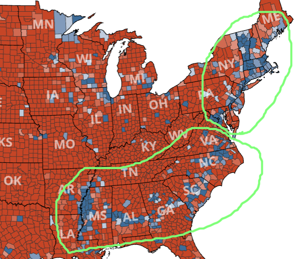
2016 elections
2016 elections[8]

Northeastern

The blue counties north of Virginia are actually part of a larger area that also skirts the Great Lakes. The reasons why Northeastern United States votes Democrat (or used to) are complex and changing (it was mostly Republican before 1990), but it is unrelated to the rest of the curve.

The emergence of the Northeast as a potential Democratic firewall has been a long time in the making. The steady realignment of the South toward the Republicans, which rendered the party increasingly conservative, called forth a counter-realignment among moderates in the North.[11]

The voting patterns of the Northeastern region would require an answer of its own, but it is related to population density, education, urban centers and social and cultural differences between the North and South. However, this answer mainly focuses on the Black Belt.

Black Belt

The southern part of the "curve" is commonly called the "Black Belt":

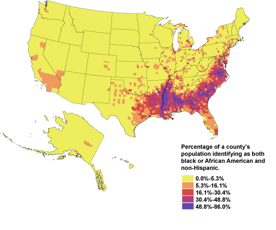
There’s an arc of Democratic strength across the interior South. This is the old “Black Belt,” named for the fertile soil that gave rise to cotton plantations. These areas are still populated by a high percentage of African-Americans even 150 years after the end of slavery, and they’re predominantly Democratic today.[1]
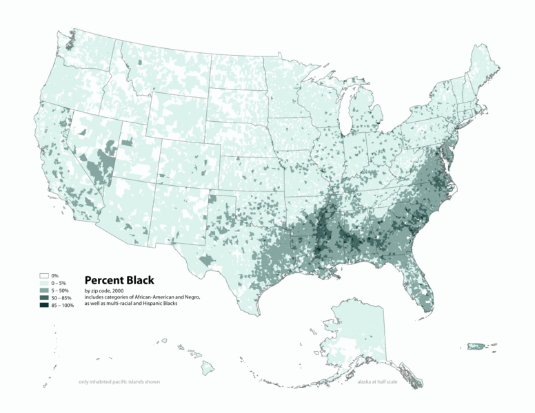
Black population by county
Black population by county[3]

Slavery and cotton picking

The soil of the Southeastern regions is fertile and well-drained, making it ideal for cotton. The black population in this region today descends from the slaves that use to work the cotton fields.

Over time this rich soil produced an amazingly productive agricultural region, especially for cotton. In 1859 alone a harvest of over 4,000 cotton bales was not uncommon within the belt. And yet, just tens of miles north or south this harvest was rare. Of course this level of cotton production required extensive labor.

As Washington notes further in his autobiography, "The part of the country possessing this thick, dark, and naturally rich soil was, of course, the part of the South where the slaves were most profitable, and consequently they were taken there in the largest numbers. Later and especially since the war, the term seems to be used wholly in a political sense—that is, to designate the counties where the black people outnumber the white."[2]

The Black Belt on election maps

I went back to previous elections and found that the "blue Black Belt" has been present in many of them.
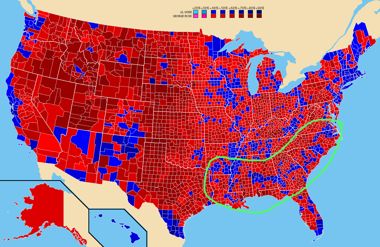
2000 elections
2000 elections[4]

1984 elections
1984 elections[5]

However, as you go further back, the belt disappears from maps because African-Americans often didn't (or couldn't) vote:

But the Black Belt has not always been visible on maps during elections. The Voting Rights Act, outlawing discriminatory voting practices, was passed in 1965. As result, a year earlier in the 1964 elections larger numbers of African Americans were excluded from the polls in Southern states. And, in turn, the blue band we see today was not visible.[2]
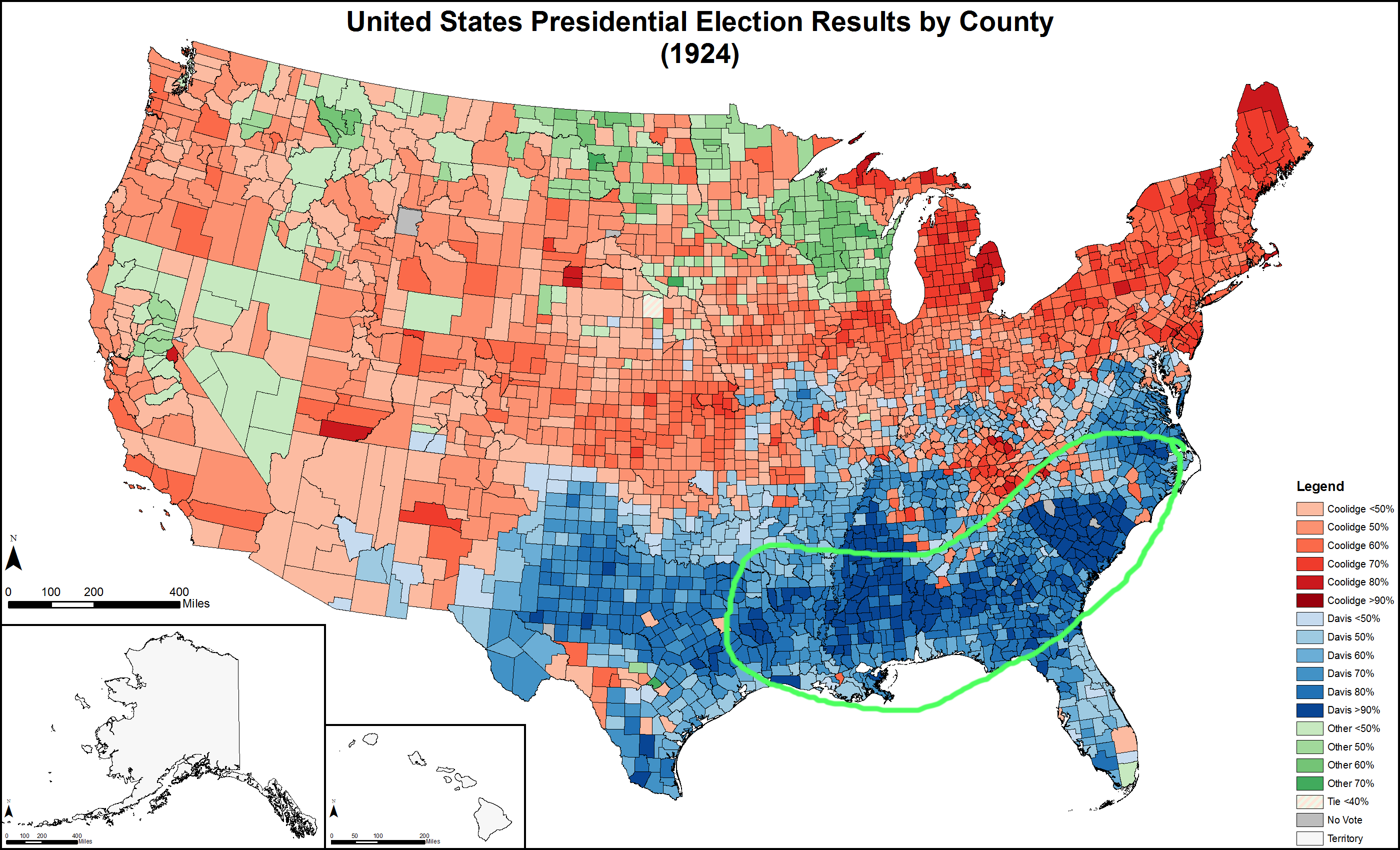
1924 elections 1924 elections[6], note the uniform blue color across the South (for the red/blue swap, see the Southern Realignment or the Southern strategy)

The black Democrat vote

Before 1948, there was no clear distinction in party identification for African-Americans, although "at no point from 1936 on, according to Joint Center data, has the Republican candidate for president gotten more than 40 percent of the black vote."[7]
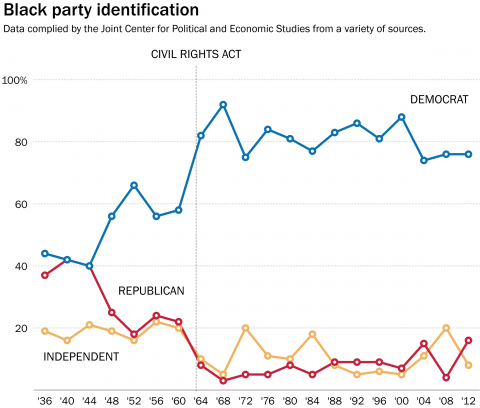
Black party identification
Black party identification[7]

There are two major bumps in party identification: 1948 and 1964. In 1948, Democrat Harry Truman talked about civil rights in his state of the union address:

Today, however, some of our citizens are still denied equal opportunity for education, for jobs and economic advancement, and for the expression of their views at the polls. Most serious of all, some are denied equal protection under the laws. Whether discrimination is based on race, or creed, or color, or land of origin, it is utterly contrary to American ideals of democracy.[10]

This was followed by requests to Congress about, among other things, protecting the right to vote.[9]

The second bump in 1964 was the Civil Rights Act by Democrat Lyndon B. Johnson. This Act would outlaw discrimination based on race and color and "ended unequal application of voter registration requirements".

Although these two actions would strengthen the black vote for the Democratic Party, it would also make them mostly unelectable in the Deep South:

When he signed the bill, President Lyndon Johnson reportedly said that Democrats would, as a result, lose the South for a generation. It's been longer than that.[7]

References

[1] What This 2012 Map Tells Us About America, and the Election, Nate Cohn and Toni Monkovic, 18 October 2016, The New York Times
[2] How presidential elections are impacted by a 100 million year old coastline, Dr. M, 27 June 2012, Deep Sea News
[3] Map of contiguous US, showing percentage of population self-reported as "Black," by census tract, 2000., Wikimedia, by user Citynoise
[4] Map showing the results by county of the 2000 United States presidential election specifically identifying the percentage received by the winning candidate in each county, Wikimedia, by user Tilden76
[5] Map showing the results by county of the 1984 United States presidential election specifically identifying the percentage recieved by the winning candidate in each county., Wikimedia, by user Tilden76
[6] Presidential election results by county (1924), Wikimedia, by user Tilden76
[7] When did black Americans start voting so heavily Democratic?, Philip Bump, 7 July 2015, The Washington Post
[8] US elections 2016 live results, The Guardian
[9] Race, Realignment, and the Election of 1948, Jay Cost, 22 April 2009, Clear Politics
[10] Harry S. Truman: Annual Message to the Congress on the State of the Union, The American Presidency Project
[11] Northeast Is the Democrats' Firewall, E.J. Dionne, 27 September 2010, Real Clear Politics
8
  • 6
    The last map is a red herring...the 1924 democrat party is an entirely different party than the democrat party of today (the black demographic would never have voted for that democratic party back then). The other info is good, but missing the major correlation...population density.
    – user1530
    Commented Nov 9, 2016 at 22:02
  • 7
    @blip The point of the 1924 map is to show a uniform color in the south, without the black belt voting differently (or at all). Regardless of the "switch", I think the black population would still have voted differently. Please, do correct me if I'm wrong. As for population density, as far as I can tell, it is irrelevant for the black belt. It might be important for the northeastern region, but that was not the topic of my answer.
    – isanae
    Commented Nov 10, 2016 at 2:35
  • 1
    the black belt refers to the south, for sure. But the main correlation with the OP's map (north to south) is population density.
    – user1530
    Commented Nov 10, 2016 at 3:54
  • 3
    This should be three (or more) parts. The "black belt" in the South; New England in the North; and three cities with urbanized suburbs in between (Washington, DC; Philadelphia; New York City). Maryland and New Jersey aren't that liberal outside the urban areas. It's just that the cities are big there and happen to make a link between the other two areas if you ignore the gaps.
    – Brythan
    Commented Nov 10, 2016 at 16:21
  • 2
    @Brythan It should probably be several books :) I don't have the time or knowledge to do research on voting patterns across the eastern US. I will however add a note to the NE section about the fact that it's not the focus of the answer and lacks detailed information.
    – isanae
    Commented Nov 10, 2016 at 18:02
45

Density of African American population

Image from CensusScope

As almost 80% of the African American voters voted for the Democratic Party, I think the correlation is both obvious and self-explanatory.

What should be held in mind is that this map is rather crude, having the darkest colour say "48.9-86%". This could explain why the "Democratic line" is slimmer than this map may implicate.

Together with population density, considering that urban areas tend to have a higher level of education and possibly better access to polls especially for African Americans that do not have much money (as registration and place of election are in foot-range and not miles and miles away), I would say there is a blend of effects, ethnicity being suprisingly strong in the indicated area.

18
  • 4
    A combination of this map and the density map actually seems to be covering most of the blue counties in the map. It's probably reductive and simplistic, but it's fascinating to me.
    – isanae
    Commented Nov 9, 2016 at 6:19
  • 3
    @isanae Bear in mind that this map says "percentage of a county's population", so it is independent of the actual population density. One could argue that in urban areas the accessability of polls - especially for poor people - is way better, though. This would explain the "blend" of the two effects. Commented Nov 9, 2016 at 6:24
  • 1
    Urban areas also have a higher rate of education and there seems to be correlation between education and voting Democratic in the US. That would make more sense to me than accessibility.
    – isanae
    Commented Nov 9, 2016 at 6:30
  • 9
    "As almost 80% of the African American population voted for the Democratic Party" -- this is incorrect. Less than 70% of the eligible African-American population voted at all and not all of those who voted voted Democrat. You may mean that almost 80% of African-American voters voted Democrat. That would actually be relatively low.
    – Brythan
    Commented Nov 9, 2016 at 10:10
  • 2
    @curiousdannii Yeah, it's a less than ideal map to illustrate this. Here is a more pronounced map. Note the similarities such as the island in northern Georgia, the stripe up and down the Mississippi, and how it comes closer to the coast in South Carolina. Commented Nov 9, 2016 at 13:29
8

The answer is likely complex in detail, but not nearly as complex on the surface as some are making it out to be.

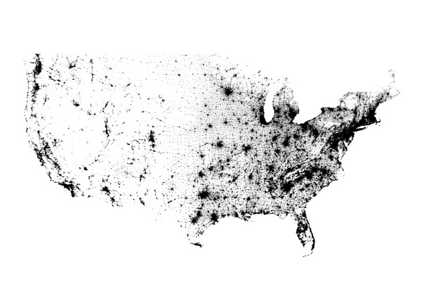
The way voter demographics have evolved in the US has led us to a point where the democrat/republican split is almost entirely* based on urban vs rural.

Overlay a population density map and you'll see that it aligns with the 'blue line' you speak of:

enter image description here

In the US, if you live in a city, odds are you are voting democrat. If you live in the country, odds are you are voting republican:

https://www.washingtonpost.com/news/the-fix/wp/2014/10/21/there-really-are-two-americas-a-urban-one-and-a-rural-one/

* I always like to point out the one anomaly of very northern MN and WI being consistently blue. For no other reason that it's interesting to me.

7
  • 1
    I actually thought so as well, but could not make sense of the parts along the Mississippi. Then I stumbled along the map in my answer, and it fitted much better. I think it is both, but 'ethnicy' (scientifically, this notion is nonsense) seems to be the stronger effect. Commented Nov 9, 2016 at 19:41
  • @PhilipKlöcking but that, alone, isn't enough...you have to account for the fact that there is a higher density of minorities in urban areas. Plus, regardless of ethnicity, you are more likely to be a democrat if you live in an urban area than in a rural area.
    – user1530
    Commented Nov 9, 2016 at 19:43
  • 1
    That said absolutely...the spot by the mississippi could certainly be an area that is mostly influenced by ethnicity. The spot I mention in the upper areas of MN and WI is likely influenced by culture. But in general it's mostly an urban/rural divide.
    – user1530
    Commented Nov 9, 2016 at 19:44
  • 1
    I totally admit that. In general, this is definitely true, as one can see in the coastal areas and other parts of the US. It is just that regarding that special contrast asked for in the area marked in the question, there seems to be some kind of shift in the relative strength of the effects. But in the end, only an ANOVA would be able to answer that question definitely. Just wanted to mention that I had the very same idea first, but found that the second distribution was striking me even more as I saw it. Commented Nov 9, 2016 at 19:49
  • @PhilipKlöcking yea, it's really hard to be definitive with any of this. In the end, the areas outside the population dense areas likely have multiple factors lending them the exception of the rural/urban split.
    – user1530
    Commented Nov 9, 2016 at 19:59
7

As others have noted, many of those counties are explained by having high concentrations of African-American voters. However, that does not explain the New England counties. Those have very few African-American voters but are overwhelmingly liberal, particularly Vermont and Massachusetts.

New Jersey and New York City have significant African-American populations but not high percentages. Urbanization seems a better explanation there.

Cotton is an even worse explanation, as some of the largest cotton areas are outside the relevant area and voted overwhelmingly Republican. Using cotton production as a proxy for African-American population seems unnecessary when we actually have direct numbers on the African-American population.

So the answer to your question is that no, that line of counties does not have anything in common other than voting Democrat. Smaller segments of the line may have more in common though. For example, most of the Southern portion of the line are rural areas with mostly African-American populations. And New England is New England.

3
  • 2
    You're saying that this an apophany? I think you could say that the line is made out of two major phenomena (black population in the bottom half, income/education in the top half), but I wouldn't dismiss the whole thing as a coincidence.
    – isanae
    Commented Nov 9, 2016 at 18:00
  • I didn't dismiss it as coincidence. I said that you can't explain the whole line with one common explanation. You can explain smaller parts of it with more local explanations.
    – Brythan
    Commented Nov 9, 2016 at 19:52
  • Cotton is not an "explanation". It's the basis for the historical pattern of black population density in the deep south whose footprint remains visible to this day. Commented Dec 3, 2016 at 3:19
5

I suspect that the underlying answer is geographical. Looking at a relief map of the USA, the blue-voting line roughly seems to follow a line to the south and east of the Appalachian and Allegheny mountain ranges.

The availability of agricultural land will have affected historical patterns of settlement, in turn affecting voting patterns. I don't know enough of American history to say what the story actually was for that area, but the voting map and the relief map seem too similar for it to be a coincidence.

4
  • 1
    Geographical features may have dictated where people are today, but it wouldn't explain why they would vote the same way.
    – isanae
    Commented Nov 9, 2016 at 18:05
  • @isanae, it might explain it. To take an obvious possibility, the descendants of people who settled on good agricultural land are likely to include a high proportion of farmers even now. Farmers have different political interests to city people and are likely to vote differently, on average.Or it might be some other chain of events but still one that was ultimately caused by geography. Commented Nov 9, 2016 at 20:49
  • Lostinfrance -- Farmers by and large are Trump supporters. motherjones.com/environment/2016/10/trump-farmers
    – O.M.Y.
    Commented Nov 9, 2016 at 21:40
  • @O.M.Y., my answer was intended as a reply to isanae's comment. I was arguing that, as a general point, geographical features can explain (or partially explain) present day voting patterns. People who know more than I do (I'm not American) about the history of those areas have suggested explanations related to the distribution of demographic groups that seem very plausible answers to isanae's original comment. My argument was that the way these population distributions originally came about had a lot to do with geography. Commented Nov 10, 2016 at 7:41
5

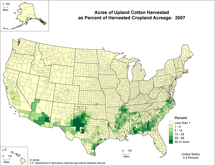
Adding on to Philip Klöcking's answer, which noted that certain areas had a high proportion of African-Americans, who are more likely to vote Democrat than Republican:

Map

This is from 2007, but I suspect it'd be similar back when cotton was harvested by black slaves.

3
  • 11
    We're talking 2016 election, not 1816 election...
    – corsiKa
    Commented Nov 9, 2016 at 7:08
  • 7
    I understand there might be a correlation between the areas where African Americans are currently living and regions where cotton was historically picked, but I don't see how this is relevant to my question.
    – isanae
    Commented Nov 9, 2016 at 8:09
  • Comments are not for extended discussion; this conversation has been moved to chat.
    – Philipp
    Commented Nov 10, 2016 at 21:18
4

In some parts, it's definitely in line with population, the Northeast Megalopolis (DC, Baltimore, Philadelphia, NYC, Hardford, Providence, Boston, etc)

But something else that stands out to me is that the band links together the state capitals of 6 of the 7 states it passes through in the southern part (MS, AL, SC, NC, VA, MD).

33 of the 49 state capitals to have come in are democratic right now, and in general quite heavily so (may well end up being a few more when all is counted, as most western capitals are surprisingly republican so far).
Even in mostly republican states, they're some of the least red spots.

To be honest, though, it's probably still quite a bit of a chicken-egg argument, because they are generally still population centers (most of the republican capitals are the tiny ones... only OKC, Topeka, and Phoenix are fairly large capitals going republican). But it's a trend I feel I've noticed through the years.

2
  • Also was thinking there might be a bit of a university town connection, but not sure it totally holds. The Tobacco Road collection, ECU, USC, and MSU are along the path. And Auburn while red is too. (Atlanta, Tallahassee, and UGA all stand out too, but are off the path). In the end, I think the racial makeup and\or population density are more likely, but just giving other theories. Commented Nov 9, 2016 at 11:06
  • See also: politics.stackexchange.com/questions/13385/…
    – wonderich
    Commented Nov 14, 2016 at 4:47
4

Mike Scott's answer is close. Geology matters.

This is a map of the "fall line", where colonial-era river transport had to transfer to other means of transport. Most of the major cities in East Coast states are along the fall line. (Cities tend to grow where transport is interrupted, especially in places that are just upstream of high-malaria regions with rich farmland.)

Major cities in the United States (even in Republican-leaning states) tend to vote Democratic. As others have noted, this is partly because large cities tend to have large numbers of Democratic-leaning ethnic groups. It is also partly because large cities tend to have larger jurisdictions, with less local control over the quality of their schools and police.

2
  • I'm not sure what the last sentence is referring to. How does "larger cities -> less local control" relate to the rest of this answer?
    – Bobson
    Commented Dec 1, 2016 at 19:40
  • @Bobson -- Less local control over schools results in worse schools, with more discipline problems. Less local control over police results in more tensions between police and civilians. Many major planks of the Democratic party platform are intended to ameliorate the resulting problems.
    – Jasper
    Commented Dec 1, 2016 at 20:00
3

It's geology, which affects voting patterns more than you might think. In this particular case, your line was coastline about 100 million years ago, which has given it a geology that makes its soil especially fertile, so it was the favoured place to grow cotton, which means it was the favoured place to import slaves, whose descendants are still there and voting Democrat. See here for more details.

1
  • 1
    That does not explain why areas away from that line which were strong slave plantation regions do not have similar voting patterns.
    – O.M.Y.
    Commented Nov 9, 2016 at 21:44
0

something interesting: http://www.deepseanews.com/wp-content/uploads/2012/06/namK85-600x580.jpeg

the ancient north american shoreline made that area super arable, which caused cotton picking to be super common there, which in turn turned it into a democract strip from all the freed slaves

1
  • Thank you for the answer, but this doesn't add anything to Mike Scott's existing answer which already links to the article this comes from.
    – Bobson
    Commented Dec 1, 2016 at 19:36
-2

Geology. Best to leave it as the 'fall line', as Mike Scott maintains. Not only did cargo transfer from water to road at this line, dramatically, this is where rivers fell, from the piedmont to the tidewater region. These are the water falls that provided power for industrialization in colonial America thru the civil war. Every river on this line has a small city and attendant road hub. The roads, manufacturing, distribution centers, and population stayed. Pretty country.

1
  • This is basically the same answer as [Jasper
    – Bobson
    Commented Dec 1, 2016 at 19:37

You must log in to answer this question.

Not the answer you're looking for? Browse other questions tagged .